Be more coherent.
A faith-driven technology ministry building tools that teach real skills — not one more feed built to keep you scrolling.
The mission · editorialMonogram, wordmark, stamp, and social assets. Every piece uses the Geist type stack, the coral-led accent palette, and the dark-first canvas from the mission. Every mark ships as both SVG (vector-crisp at any size) and PNG (drop-in raster for slides, docs, and anything that won't take a vector), or Open raw to inspect the markup.
Fonts render as Geist on this page (via next/font). For print/merch use, open the SVG in Illustrator and Type → Create Outlines so the files are portable across machines without Geist installed.The interlocking marks don't need outlining — they're pure path geometry.
My recommendation
Use C Daddy face · Rizz Coral as the primary brand mark.
The illustrated character bust is the face users see in the main header of every subdomain. Use the letterform CD kit below as a text-size fallback for inline mentions under 24px, and the wordmark lockups for headers and social cards where the brand name needs to read at a glance.
Every surface, text color, border, and interactive state derives from this palette — coral-led, with sand-gold and green as bounded, semantic accents and a Work-only steel-blue. Nothing outside it ships.
Dark canvas · landing, tools, token
#0E0E10#18181B#F2F1ED#A1A1A6#1D1D20Light canvas · mission, blog, shop
#F8F7F4#FFFFFF#6B6B70Accent + semantic
#FF6B4A#E5553A#4A9D7C#D94343Dimension accents · coral-led, multi-color
Live: homepage + /what-you-getCoral stopped being the only accent. It still leads every frame — but two dimension siblings and a Work-only secondary now carry meaning where coral alone can't. Reach for them deliberately, never as decoration.
#FF6B4A--dim-bodyThe lead. Default accent, CTAs, focus, active — coral stays primary everywhere.
#C8A96E--dim-focusA Coherence-Check dial and rotating sibling cards. A member of a set — not a standalone shout.
#4A9D7C--dim-directionThe 'free / given' affordance and the go / validation cue. Doubles as semantic success.
#5B78B5--brand-secondaryWork / Business only — the Life = warm coral / Work = cool steel-blue duotone. Never elsewhere.
Coral is the default — use it unless there's a reason not to. Gold and green appear only as bounded, semantic siblings (a set of dials, a rotating card trio, a "free" affordance, a direction cue). Steel-blue is scoped to Work / Business surfaces only. The banned list is unchanged: no cyan, purple, neon glow, or rainbow decoration. Today the broadened palette ships on the homepage and /what-you-get — extending it site-wide is an open owner call, so don't repaint other pages by default.
Two texture primitives extend the brutalist register. Applied only inside Brutalist Accent blocks — Merch section, Site Score, Token page. Never on Editorial Minimal surfaces (hero, blog, tool pages). Source: utils/seo/og-textures.tsx.
ScanLines on Rizz Coral
The canonical brutalist surface. Merch section, token hero, coral-fill OG cards. Gives the "printed coupon / CRT" feel the brand is built on.
color="canvas" · opacity=0.4 · spacing=3ScanLines on Dark Surface
Dark canvas variant for OG cards with deep canvas backgrounds. Subtle — the lines whisper rather than shout.
color="ink" · opacity=0.14 · spacing=3FineGrid — blueprint
Coordinate grid for data-heavy cards. Blueprint / technical feel. Lower visual weight than ScanLines.
color="ink" · opacity=0.045 · pitch=56pxAlways import <ScanLines> or <FineGrid> from utils/seo/og-textures.tsx. Do not inline-copy the repeating-linear-gradient CSS string — seven files currently do this and should migrate on next touch.
Hierarchy through weight × contrast × space — not raw size. No arbitrary pixel sizes. No Inter.
Geist 700 · −0.035em · lh 1.05Geist 700 · 4.5rem · −0.03emGeist 600 · 2.75rem · −0.02emGeist 600 · 1.375rem · −0.01emGeist 400 · 1rem · lh 1.6 · max 65chGeist 400 · 0.875rem · lh 1.55JetBrains Mono 500 · 0.8125rem · +0.02emJetBrains Mono 500 · 0.6875rem · +0.14em · uppercasePre-rendered cards across the editorial and brutalist registers. Right-click any card to save the PNG. The full set with sections, framing notes, and per-card guidance lives on the OG preview page.
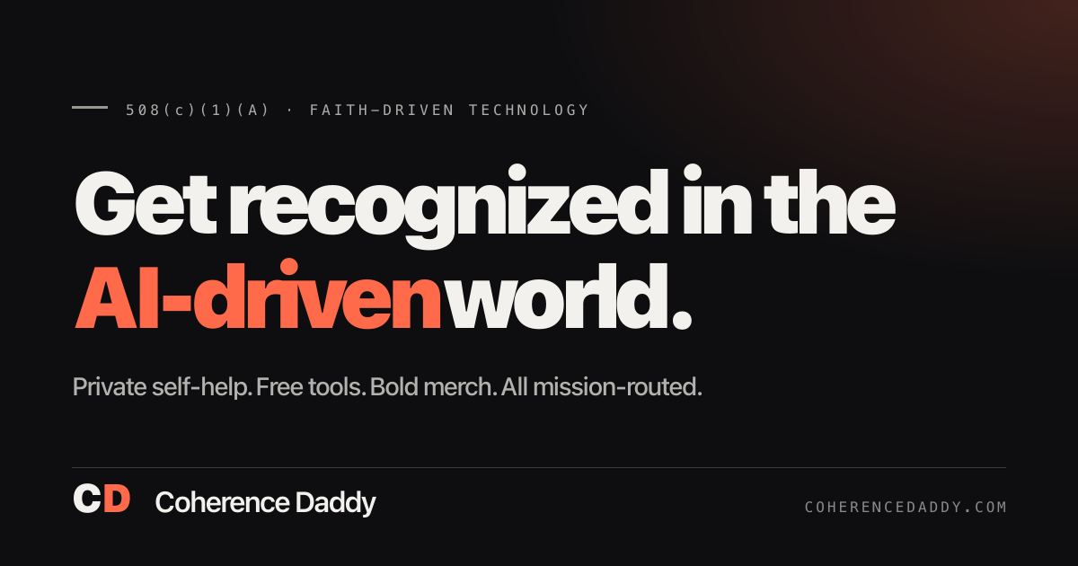
Want every variant in one place? Open the full OG preview → — section TOC, framing notes, brutalist vs editorial register tags, and the raw PNG endpoint for every card.
Six brand-level ad concepts — no product promises, no hype. Each is the coral-led palette in the wild: coral leading, green carrying the "free / given" note, gold + green as dimension siblings, and steel-blue holding the Work side of the Life/Work duotone. Built in live tokens, so this is the design system — not a mockup of it.
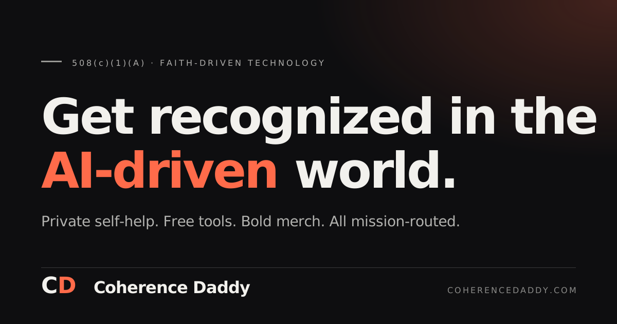
A faith-driven technology ministry building tools that teach real skills — not one more feed built to keep you scrolling.
The mission · editorialHundreds of tools, given away — a ministry serves before it ever asks.
Green means given · editorialWe answer to a mission, not a growth chart — and it shows in what we refuse to build.
Built for the people already tired of the static — real skills, hard edges, plain talk.
#FF6B4A#C8A96E#4A9D7CDownload the set · 1080×1350 PNG
Tap to open · right-click to saveConcept onlyBrand-voice explorations for placement, tone, and color discipline — not published ads. Every claim stays brand-level (the ministry + the mission), with zero income, privacy-tech, or outcome promises. Coral leads all six; gold, green, and steel-blue appear only in their documented roles.
Every mark below ships as both SVG (vector-crisp at any size) and PNG (drop-in raster). Grab either format, or Open raw to inspect the markup.

Vector path-only face mark in Rizz Coral on transparent. Use anywhere the face needs to scale crisp — OG cards, headers, large hero panels, print. Recommended over the PNG for any responsive display.



Vector black face inside a Rizz Coral circle. Used on coral-fill OG cards (the coral circle merges with the card background, leaving a crisp ink face). Also the canonical round social avatar.

Vector coral face inside a deep canvas circle. The 'app icon' lockup at any scale — App Store icon, mobile home-screen, round avatars on light timelines.

Vector white face on Rizz Coral circle. High-contrast option for dark coral fills or complex backgrounds where the ink version disappears.

Vector white face inside a deep canvas circle. Inverse of the coral-on-ink lockup — use on coral or warm-tone surfaces where the orange portrait would clash.

Typographic CD set in Geist, C in ink + D in coral. Use for small-format mentions where the interlocking mark is too detailed (inline body text, favicon secondary).

Single-color letterform for dark surfaces. Fallback when duotone clashes with surrounding art.


Full-accent letterform. Treat it as the frame's single lead mark — don't stack it against a second coral focal point.

Stroke-only letterform. Embroidery reference, small chrome, or subtle inline mentions.
Header lockup for dark canvases. CD letterform, vertical rule, wordmark, mission sub.


Brand system notes
noindex, nofollow and absent from the sitemap.